Introduction
AK architectures new logo, we like to be creative. The first project we undertook was the design and draughting of our logo. In case you haven’t guessed AK is the initials of Ashley Keenon Managing Director of AK architecture.
Simple, Sleek, Sophisticated Architecture Logo
The project brief was clear and straightforward: create a simple yet sleek logo. Following this guideline, we started our design journey and went back to the drawing board. At this point, we brainstormed and sketched many ideas and concepts. Each sketch moved us one step closer to the visual identity we wanted to achieve.
Sketch Design Phase of AK architectures new logo
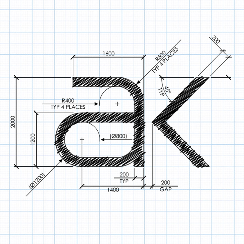
Through numerous revisions, iterations, and variants, the design gradually refined. Each concept underwent meticulous scrutiny and refinement, gradually narrowing down to a select few that encapsulated our brand’s spirit. Then, we imported these shortlisted designs into AutoCAD for further refinement.
Precision in New Logo Design
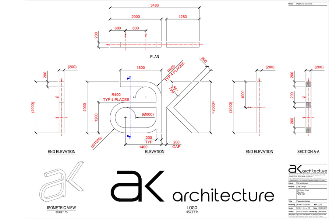
In AutoCAD AK architectures new logo sketch idea was further refined. In CAD precision took precedence. Minute adjustments and tweaks were made, each alteration bringing the logo closer to its final form. The result is a logo that’s not just a visual identifier but a symbol of our commitment to precision and excellence in design. A technical drawing of the logo was created, allowing for various applications. And if built to a 1:1 scale this would mean a striking 2-meter tall version.
Conclusion
We started with initial sketches and during the process of designing AK architectures new logo, we also had time to consider our vision for the business. The new logo isn’t just a graphic. Instead, it stands as proof of AK Architecture’s commitment to simple, elegant, and precise design.
Check out some of our other projects on the following webpage or on Instagram
Consider exploring these informative pages as well.